Typography is not only about making the words legible, it is also more about art which is important in a graphic design. Excellent typography is something that can turn an amateur designer into a professional, because it attracts the client’s attention and distinguishes the designer from among others. That is why there are some key fundamental rules you should never break when it comes to typography.
Learn the basics.
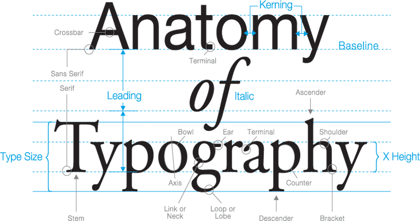
Even if you are a pro, it is always a good idea to refresh your memory about the basic principles. The composition of typeface contains specific vocabulary, central specs and accurate measurement that should be learned by heart and always remembered. Try to imagine how impressive you sound when you demonstrate to your clients that you know what words like ascender, descender, x-height, leading, kerning, tracking, serif, and sans serif mean. When you are aware of the rules, you know when to break them and it will not cost you a lost project.
The easiest and most visible improvement you can make to your typography is to use a professional font.
Watch your kerning. Briefly, kerning entails adjusting the space between two letters in the designated font. Do not mix this up with “tracking” which is adjusting the space between all letters simultaneously. Many designers do not pay attention to the kerning issue, so it does not disappear. Be aware that Adobe Illustrator does not fix it perfectly. Try to focus on the negative spacing between the letter more than on the actual letters as they are, and make the space visually acceptable within the word, so your typography will look properly balanced.
Take font communication into account. Since there is a psychology linked to some of the typefaces, it is critical to choose the type accordingly to your primary audience. That being said, the type you use should be appropriate for the market. You would not use colored font for a lawyer’s company, would you? Instead of that you would choose thick types with hard edges, because they look more masculine. Even though it may sound obvious, this rule is one of the most important for quality-designed typography.
Practise correct alignment. Alignment is a quite important principle in typography. Pseudo-designers usually select between Center Aligned and Justified, which makes paragraphs unreadable. According to MS Word there are four key alignment options: Left Aligned, Center Aligned, Right Aligned, and Justified. Left alignment or Flushed Left is used almost everywhere, because this position is easy on the eyes. Right alignment or Flushed Right position works only if it is used correctly. Justified usually terrifies most experienced designers. One more thing to keep in mind is to mix the alignments carefully, because it may cause confusion with the text.
Limit your fonts. If you need more than one font, ensure that you limit the selection to two or three typefaces. You can use one font for the body, another one for the header, and the last one for the subhead. You may even experiment with different typeface families until you reach a cohesiveness in the pairing. Yet choosing two similar types might be construed as a mistake on your part. That is why it is essential to choose the typefaces carefully.
Select a good secondary font for pairing. Type pairing makes your design readable, so when you have chosen the primary font, it is time to choose another one to emphasize and complement it. The second typeface has to be as fascinating as the primary font without diminishing its impact.

Robin Fowler
We hope that the above mentioned rules will help you get started, or simply choose HB1web for your next design project requiring typography. We have many years of experience to help your project succeed.
Comments 3
Commenter 1 Reply
You ommited in your blog anything about font stretching, something I think is very important to remember. Any reason why?
July 1st, 2019Commenter 2 Reply
Yeah, a very important point. I think I will come back to this blog and update or, prepare a part two. Thanks for pointing out this ommision.
July 02, 2019Commenter 3 Reply
I personally really enjoyed reading your blog, thank you and looking forward to your part 2. Can I ask if you can please show some examples of good and bad typography. I like to see any differences.
July 17, 2019